Solaris at Kissimmee
A residential ecosystem designed for real life connection and everyday luxury
00
problem
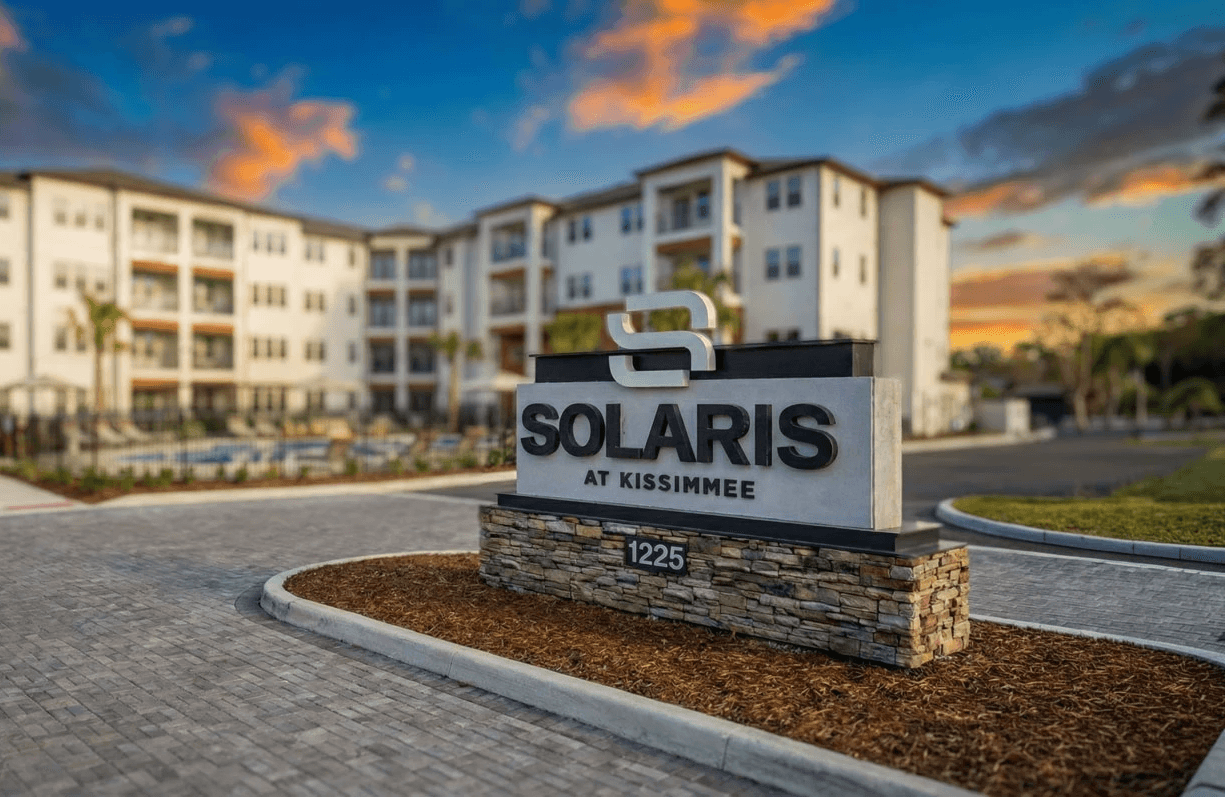
The Kissimmee rental market is crowded with communities competing for attention using the same visual language. While Solaris was built around ideas of space, connection, and ease, those qualities are difficult to communicate in a market dominated by overstated luxury cues. The challenge was to visually express a sense of calm and livability in a region defined by motion, density, and noise.
solution
\We created a calm, livable visual identity for Solaris using a simple logo system, soft natural colors, and light-filled imagery. The brand uses open layouts, generous spacing, and restrained design elements to create a sense of space, privacy, and ease. Every visual choice works together to help people understand how living at Solaris feels from the moment they encounter the brand.
Solaris was developed as part of Living Residential’s broader approach to ownership: focused, disciplined, and long-term. The brand needed to reflect an organization that prioritizes operational clarity, financial stability, and resident experience across a growing national portfolio.
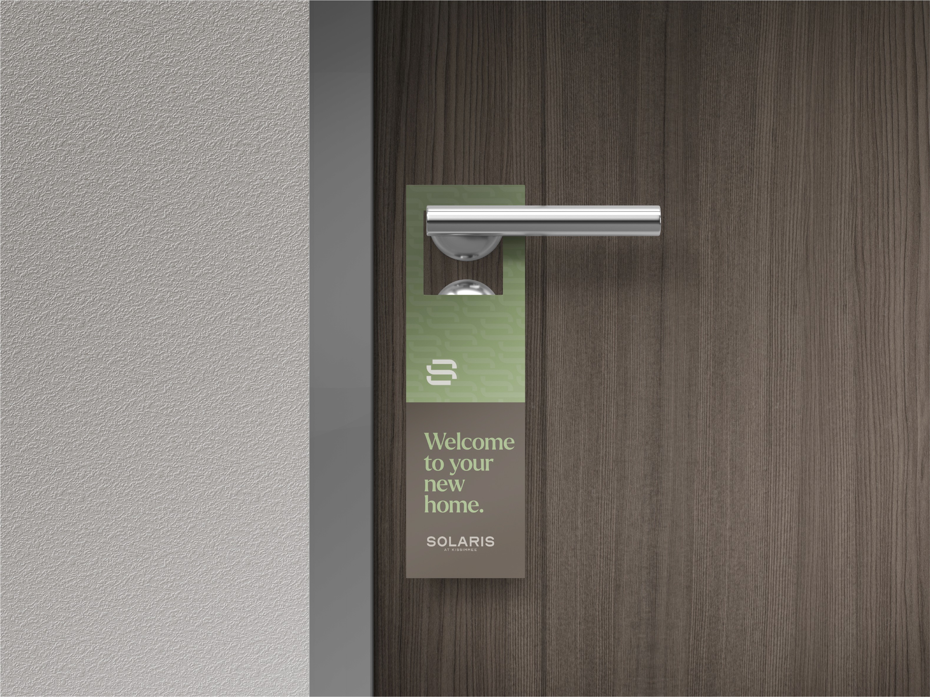
Solaris launched with a clear, confident presence that immediately differentiated the property in the Kissimmee market. The visual identity brought cohesion across digital, leasing, and on-site touchpoints, giving Solaris a recognizable look that felt intentional from day one. The brand provided Living Residential with a strong foundation that supports leasing efforts and positions the property as a considered, well-run community
01

02

03

04

05

06