Soka Suites
A new Expression of Extended Stay
00
problem
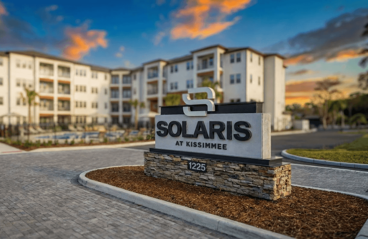
Extended-stay hospitality sits between traditional hotels and apartment living, but without a clear point of differentiation it can feel like “neither here nor there.” For Soka Suites — a property that combines spacious suite-style rooms with hotel amenities — the existing perception didn’t articulate why someone should choose it over a standard hotel or a furnished rental. The brand needed to clarify its identity and value for both business and leisure travelers unfamiliar with the concept.
solution
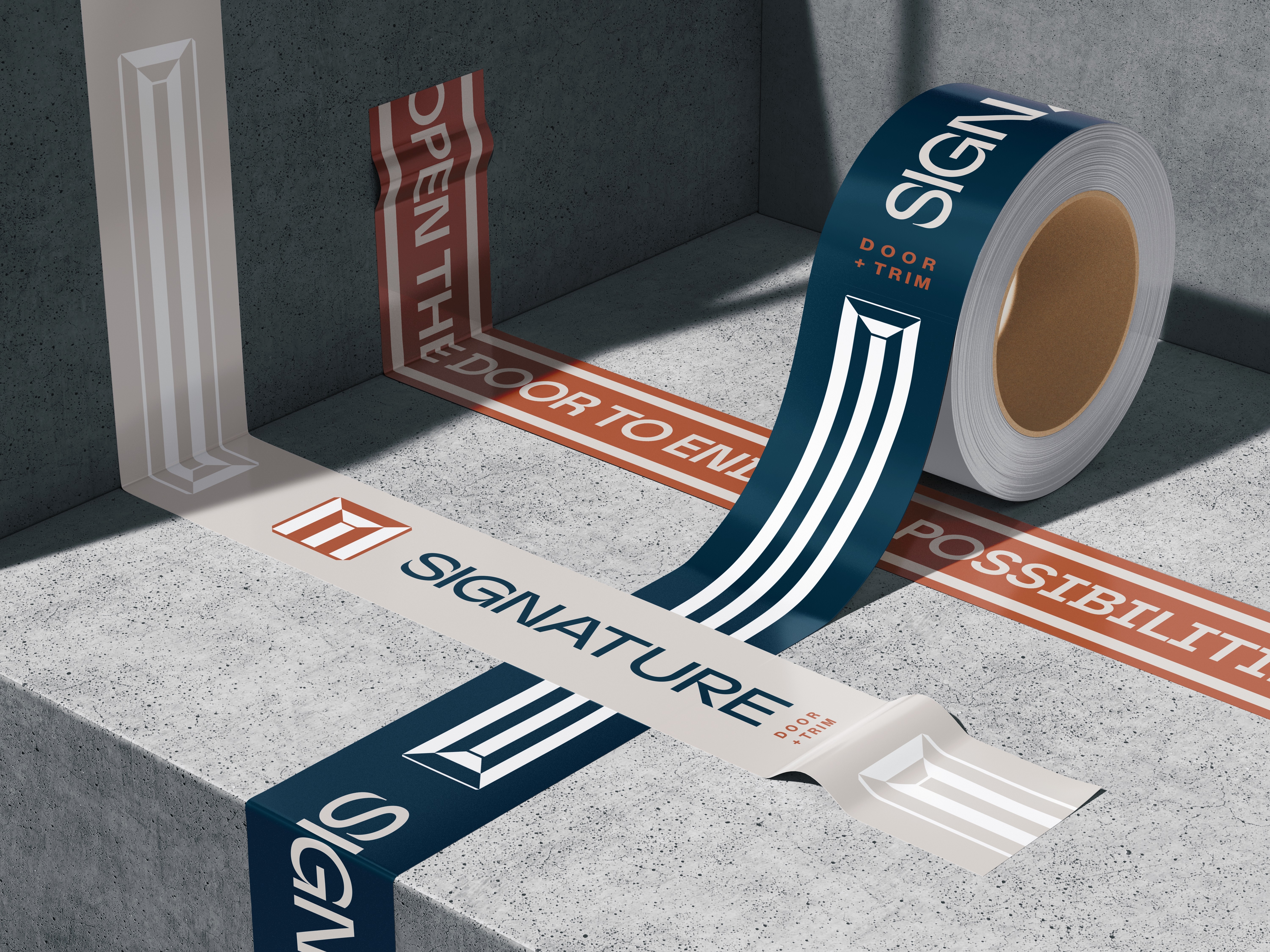
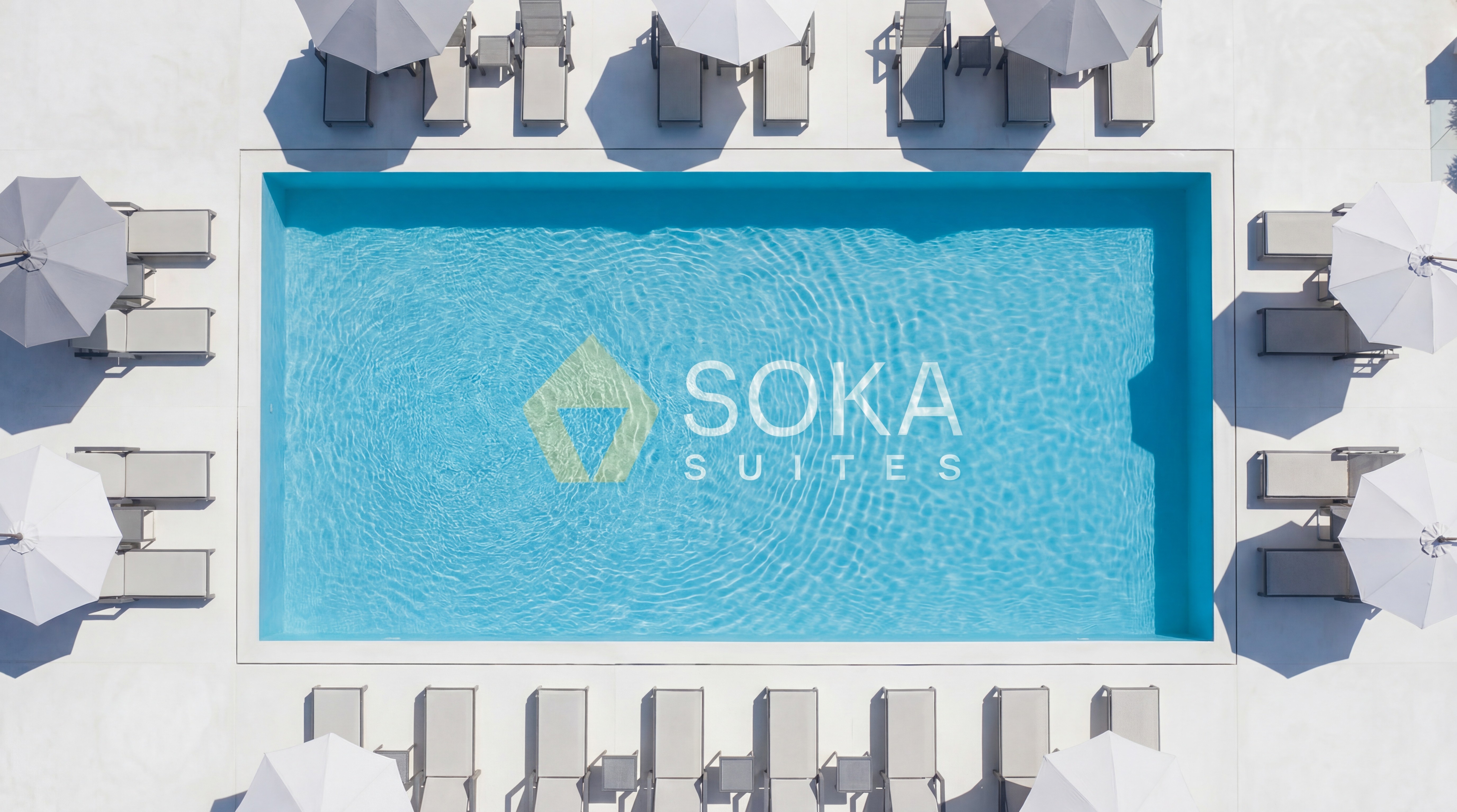
We crafted a brand identity that communicates both the comfort of home and the convenience of hospitality. The visual system balances warm, residential cues with professional hospitality touches, allowing Soka Suites to read as spacious and welcoming without feeling generic. The identity reframes extended stay as a distinct experience — one that offers more than a night’s stay and less commitment than a lease — helping guests understand the value proposition at a glance.
When a concept lives in a hybrid category, clarity becomes the differentiator. The Soka Suites brand was designed to make the idea of “home-away-from-home” tangible through tone and structure, helping guests immediately grasp what the experience feels like and why it matters.
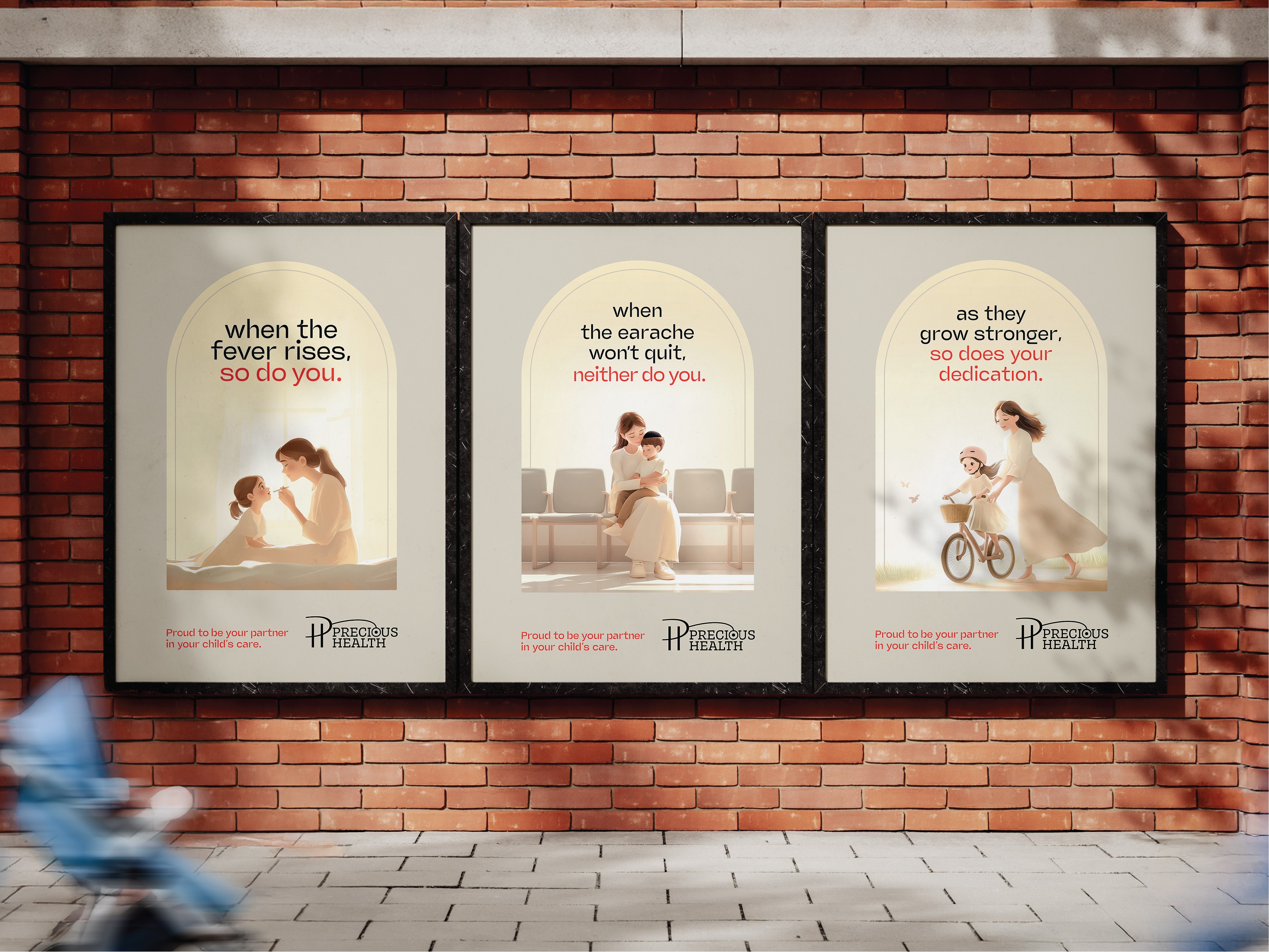
The visual identity established Soka Suites as a credible player in the extended-stay segment, supporting consistent communication across touchpoints. Guests now encounter a cohesive presence that clearly signals comfort, space, and hospitality — positioning the property as a thoughtful alternative to both short-term hotels and traditional rentals.
01

02

03

04

05

06